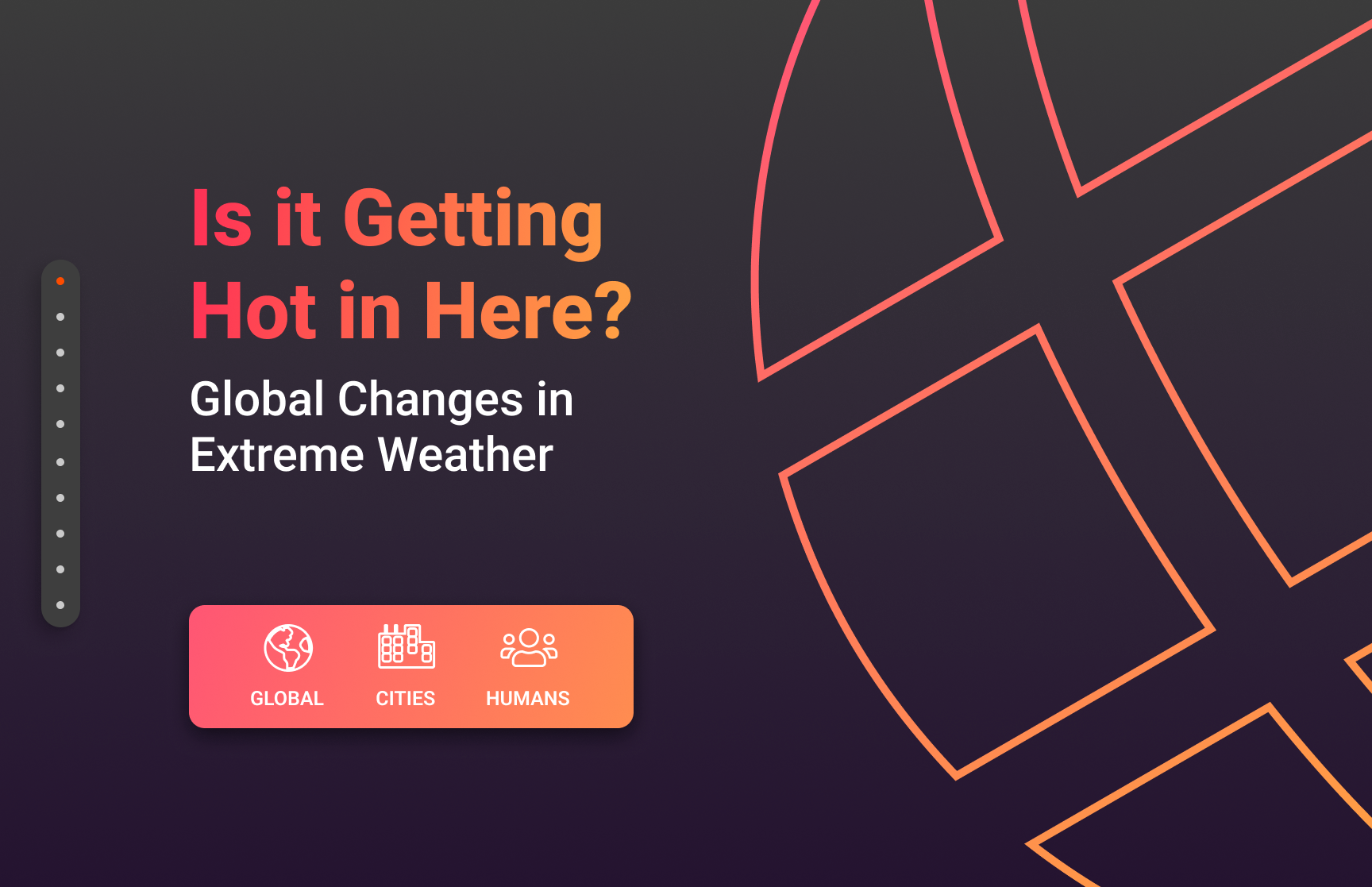
Is it Getting Hot in Here?
Interactive Web Visualizations of Extreme Global Weather Events 🌍
Full Stack Dev
Nov 2021 - Dec 2021
Overview
I had the pleasure of taking Harvard's famous Visualization course, taught by Hanspeter Pfister.
There, I learned the ins and outs of JavaScript libraries like D3.js and Three.js, which we used to build our final data visualization project.
Introduction
Raising awareness of a global issue
For our final project, we were tasked with creating an interactive website containing various data visualizations that formed a cohesive story.
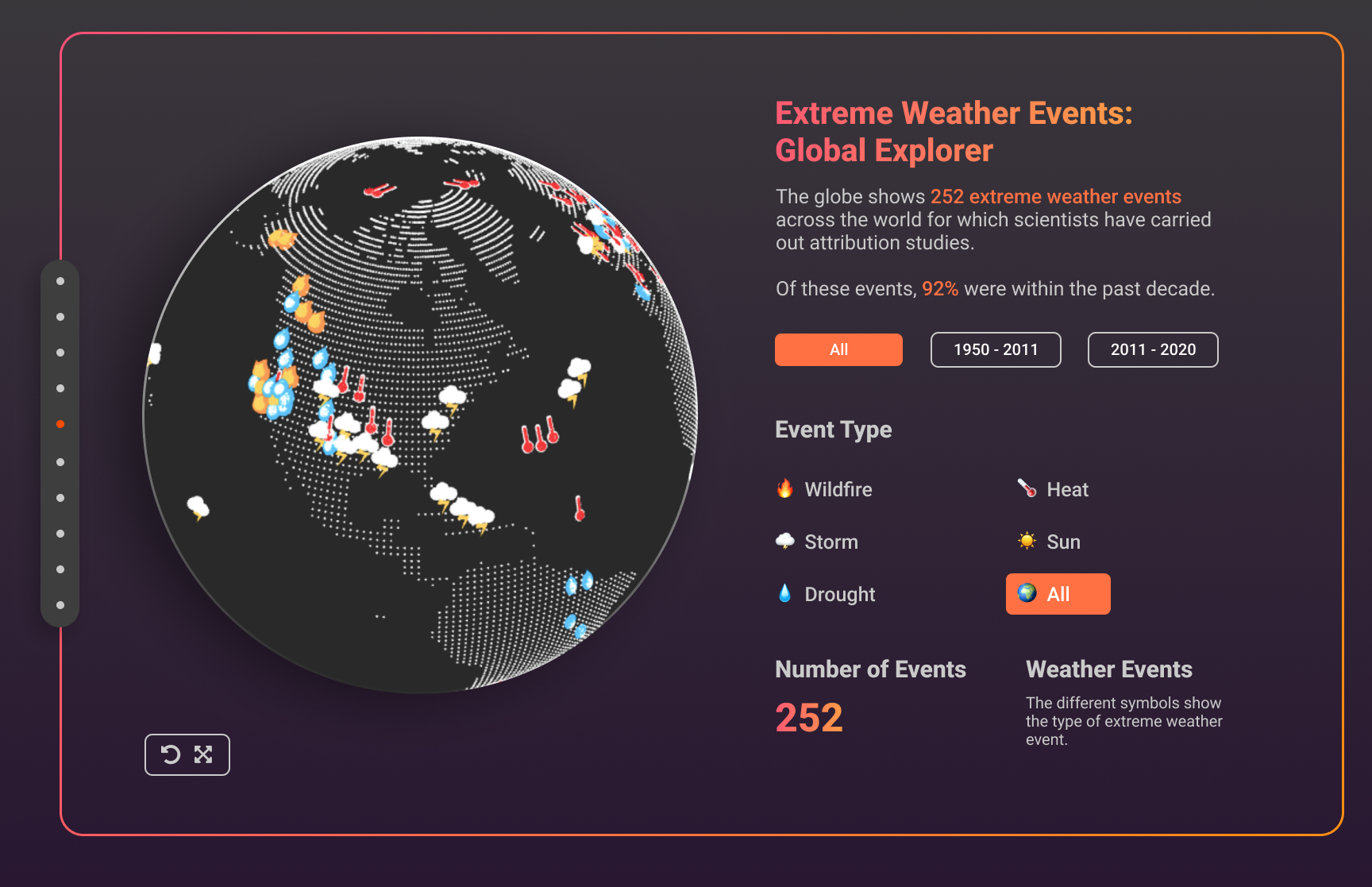
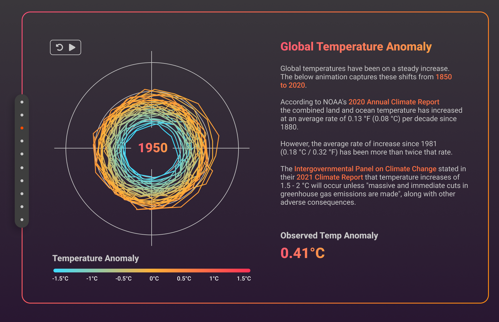
We ultimately chose climate change as our topic, an issue that has seemed to shrink away form the public eye in recent years. However, the problem is more real than ever, and we aimed to create a body of interactive visualizations that scrapes objective data from the National Weather Service, as well as the Extreme Weather dataset by NOAA, both of which are publicly available and from reliable government sources.
Core questions
1. What are the places most affected by extreme weather?
2. What are the human impacts of global changes in extreme weather?
3. How can we convey this data in a fun and interactive way?
Implementation
Creating the visualizations
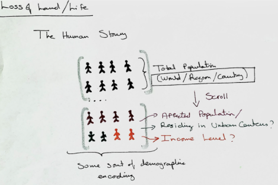
Brainstorming
We spent a long time making sure the data we were going to use would be clean enough for us to scrape without spending out entire project timeline on cleaning the data. We wanted to focus on three main areas, from macro to micro: global, city, and personal impacts. The goal was to paint a story that resonated with the user: climate change is an issue affecting everyone.
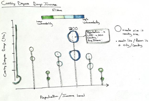
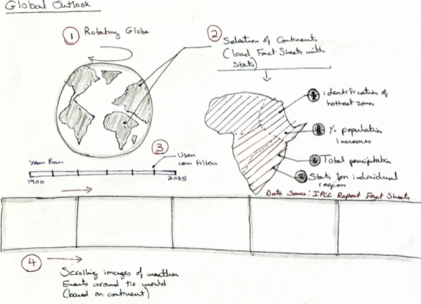
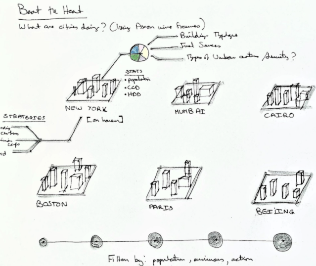
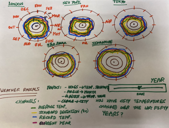
Before diving into implementation, we generated over 20 sketches of potential visualizations and voted on our top choices that would make it into the final website.
First Pass Implementation
For consistency, we set up a design system and standardized our CSS rules and the JavaScript packages we would use throughout the project.
The majority of our visuals were created using D3.js, and the globe was created using Three.js, a package I was super excited to learn. Luckily, the two libraries allowed for relatively seamless integration, which allowed for smoother experiences for both development and users of the final product.
Redesign
Our v1 implementation of the website was practical, but I felt we had lost our initial vision ofan aesthetically pleasing experience. We were able to conduct user testing to gather feedback on v1, but unfortunately we did not have time to implement all of the changes we would have liked within the time constraints of the project. Though we did not have enough time to implement it in JavaScript, I redesigned the website to reflect a cleaner, more polished experience.
Reflection
Though I had experience in web development before this project, I do think it made me much more comfortable in it, not to mention I learned about D3.js and Three.js, two libraries I had always wanted to learn. Somehow, we managed to win the Best Project Award out of 29 total projects, earning us a spot on the Harvard CS 171 Hall of Fame!
Despite the award, the website in and of itself was a great experience learning about creating a data-driven experience that would drive users to learn more about important issues.
Recommended 🔎