Battle.net Mobile App
Enhancing how players interact with their games 🎮
UX/UI Design Intern
June 2021 - Sept 2021
Hao He, Rob McCoy (mentor), and the rest of the mobile team!
New: Jump to the final version of the features, now available on mobile devices!
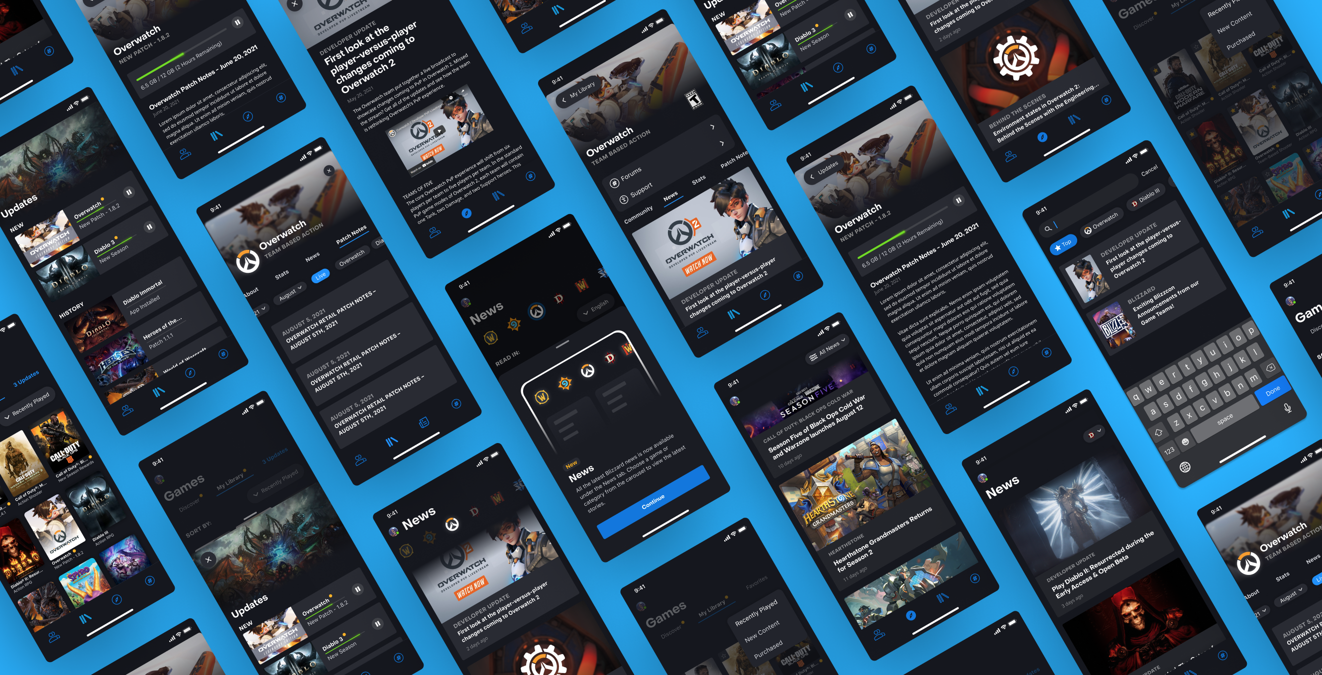
Just a few of the many iterative mockups I made during my internship
Overview
I have always loved video games. They're the main reason I fell in love with creating experiences for users. However, a lot of my experience before joining Blizzard involved more self-contained experimental projects, so I was extremely excited to get the opportunity to spearhead design on two new features for a product reaching millions of gamers.
During my internship, I worked on the Battle.net mobile app, a hub for players to socialize while playing Activision-Blizzard games, learn more about their favorite games, get customer support, and more.
Specifically, my mentor gave me a very open-ended problem: the Battle.net mobile app currently has robust social features, but is lacking in player utility features. The team had just launched a Forums tab on the app, which had driven greater user engagement. I wanted to design features that could improve both user acquisition and retention while enhancing the overall experience for users, so I did an informal competitive analysis and thought about what features I like (or would like!) in existing gaming companion apps. I worked on two new utility features: News and Game Library.
Problem
Objective
Results
4M+
monthly active users
56%
increase in user satisfaction
2 tabs
allowing for easy in-app utility access

Pain Points
Through user interviews, telemetry data, and previous user research on the Battle.net desktop app, I was able to identify the top pain points in the current mobile interface.
⏱ Slow interactions
It takes users 6 taps to find News in the app, which discourages them from engaging with the feature.
🛑 Interrupted flows
Many of the current utility options redirect users to external sites instead of integrating seamlessly within the app.
❌ Subverted expectations
News and Game Library are two of the most used utility features on the Battle.net Desktop app, but are absent on mobile. This may discourage users who are already familiar with these features.
🧠 Cognitive overload
Currently, it is unintuitive to find Games or News in the app, with users having to rely on trial and error before learning the proper interactions.
Goals
How do we design new utility features to drive greater app engagement and user satisfaction?
1 /
Create easy-access tabs in navbar for News and Game Library
2 /
Design intuitive interactions with appropriate affordances
3 /
Avoid cognitive overload and validate with user testing
Process
Iterative design
Sparking Discussion with Wireframes
On my first day at Blizzard, I was given access to the company's Figma team and started to learn the lay of the land. I was blown away by the meticulous design systems in place, but was surprised to learn that my team had no system in place for creating wireframes.
I started my design explorations for the News feature by creating some wireframes, which proved to be immensly effective during high-level discussions with engineers and PMs. Because of the increased efficiency in meetings and conveying design thinking to expedite the development pipeline, I created a Wireframe Design System for the team.
In the wires themselves, I was experimenting with 3 potential directions for delivering News to users: filtering news by game, aggregating all news into a single feed, and embedding news on individual game paged nested within the game library. After a few feedback sessions with engineers, designers, and PMs on my team and beyond, it soon became clear that this third option would impair access to the feature. The option for aggregating all news, though cheap to develop, would come at the cost of user frustration with a lack of content control. So I decided to iterate on the game filtering user flow.
Iteration
I spent a lot of time iterating on the design and user flow of the News tab, gathering feedback as I went. I worked with the Content UI team to discuss the most efficient and elegant ways to bring News into the app. Setting up meetings with engineers and PMs on multiple teams helped me understand that collaboration and communication are especially crucial early on in the design process.
A sample set of high fidelity mockups comparing possible looks for the News tab. Feedback on these iterations helped me decide on which direction to pursue for the final designs.
Above, you can see the evolution of the high fidelity designs for the feature. Through conversations with other designers, I realized there were faults in my initial design thinking, allowing me to improve on subsequent iterations. For instance, PMs helped me realized that the swim lane might not be scalable as more games are added to the library. The localization team helped me understand that a dropdown for language selection wasn't strictly necessary since this is handled by the user's geolocation.
Through these conversations, I grew as a designer at an incredibly fast pace.
Story Mapping
During my internship, I wanted to lead at least 3 formal feedback sessions. These took the form of hi-fi design feedback from the entire design org, prototype critiques, and user story mapping with my team. Story mapping was especially insightful, as it allowed us to create an affinity map of potential directions to pursue based on the many different perspectives of our team members.
Eventually, these ideas informed the final user stories I designed to map out all possible user interactions with a feature. Mapping the user journey not only helped me think about new interactions, but prompted me to consider if there were any gaps in the user flow that needed to be revisited.
A/B & Usability Testing
In order to validate my design decisions, I conducted A/B and usability tests. These helped me understand how a user would interact with these features for the first time. Asking users to narrate their thought process also helped keep a record of how intuitive each step of the user flow was.
Prototyping
Interactive prototypes helped me convey my exact vision for the features I was designing. Though prototyping in Figma still hasa long way to go, it's an extremely valuable tool for quick iteration and RITE testing without having to commit to extensive development time.
Design Handoff to Engineers
A huge milestone in this internship was the opportunity to handoff my designs to engineers for implementation. This consisted of compiling my designs into coherent user stories in which I accounted for more than just the core interactions: scroll states, loading states, empty states, error screens, etc. had to be considered for implementation.
Working through the handoff template allowed me to understand what states I may have overlooked and needed to address through further design consideration. Once completed, the complete story allowed for a comprehensive and easily digestible breakdown of the feature's intended UX, making it easy for PMs, engineers, managers, and designers to understand the feature at a glance.
Result
A few months after my internship, the game library feature was released on mobile devices! The final experience integrates all game information on conslidated game pages to facilitate discovery.
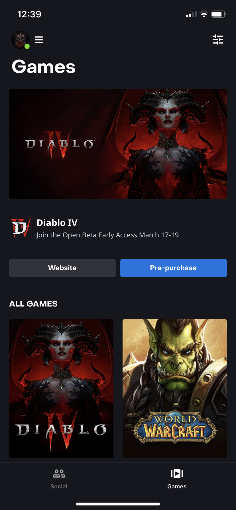
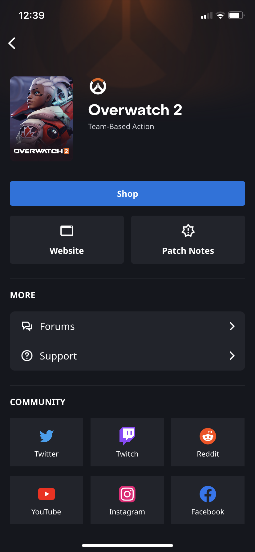
The game library in the current version of Battle.net!
Takeaways
My time at Blizzard was incredibly fun and helped me grow exponentially as a designer. I learned from some of the best UX designers I've ever met, and felt welcomed and included throughout the entire process.
- Adversity can help you grow / During the summer of my internship, many ethical issues arose at Blizzard. Advocating for inclusion and change alongside my teammates helped remind me that staying true to your values can help you through difficult times. The openness and support provided by my team demonstrated that helping others is at the center of what we do as creators.
- Gather feedback from anyone who'll provide it / After my first few weeks, the main actionable feedback I received was that I could be more proactive in reaching out to others. I hadn't realized it, but setting up meetings with other teams, casual 1:1s with new faces, and general feedback sessions was highly encouraged. So I took initiative and tried to speak to as many coworkers as possible, whether to gather design feedback or simply to learn more about them as people.
- Focus on the user / As a gamer, working on a product used by gamers helped create a strong sense of user empathy. Even if you might not be a part of your product's target audience, understanding the user is crucial to building a compelling experience. As designers, it's our job to make products that solve problems in ways that feel natural.
Thanks for reading! 🤠
Recommended 🔎